Facts and data on pictograms

Synonyms / Other Terms Used
Slip, Slip Hazard, Slippery Surface, Slippery Gangway, Slippery Ramp, Slippery Steps, Slippery Area, Slippery When Wet, Danger of Falling
Category
Safety Symbols, Warning, Hazard Warnings, Hazard Signs
Message / Function
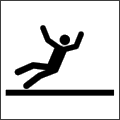
To warn of a hazard or danger from a slippery surface
| Source | Description | |
|---|---|---|
 |
Brady | Human figure falling backwards |
 |
USDC | Human figure falling backwards |
| Handbuch wien.gv.at | Human figure in outline, falling backwards, horizontal line underneath | |
 |
ISO 7010 | Human figure falling backwards, horizontal line underneath |
 C) C) |
Collins | Human figure falling backwards, horizontal line underneath |
 a) a) |
Marom-Tock | Human figure falling backwards, horizontal line underneath |
 |
Dreyfuss | Human figure falling backwards, horizontal line underneath plus several lines indicating motion |
 |
BS 5378:1980 | Human figure falling backwards, several curved shapes indicating liquid |
 |
Seton | Human figure falling backwards, several curved shapes indicating liquid |
 |
SafeStart | Human figure falling backwards, curved shape indicating liquid |
 |
PNGWING | Human figure falling backwards, ellipsis underneath |
 |
SLL | Human figure falling backwards, wavy line on bottom behind |
 |
Brady | Human figure falling backwards, wavy line on bottom behind |
 |
Preproom.org | Human figure falling backwards, two lines with several curves underneath |
 |
Eco-Mo Foundation |
Human figure falling backwards, two curved motion elements underneath |
 |
Olgyay | Human figure falling backwards, curved motion element underneath |
 |
Hora III:SSL | Human figure falling backwards, curved motion element underneath |
 |
Creative Safety Supply | Human figure falling backwards, curved motion element and curved shape underneath |
 b) b) |
Marom-Tock | Human figure falling backwards, irregular shape below and curved motion element above |
 |
SSRS | Human figure falling backwards, curved element underneath |
 |
U.S. National Park Service |
Human figure falling backwards, triangle indicating ramp below |
 |
U.S. National Park Service |
Human figure falling backwards, stairs underneath |
 |
HSSS | Human figure falling backwards, irregular shape and wavy line below indicating rocks and water |
 |
NARSSM | Human figure falling backwards, irregular shape below |
 B) B) |
USDC | Two legs with shoes, S shaped line below |
 A) A) |
USDC | Tilted boot with S like shape below |
 |
NM | Horizontal line, above water shown as four wavy lines |
Note: Some of the examples shown above were mirrored horizontally to contrast differences.
Discussion
The wealth of pictograms available to warn of a hazard or danger from a slippery surface is remarkable, and most are based on displaying a human figure falling backwards. Arms, legs, and body are shown in all possible arrangements, but also numerous versions of environments in which this figure is falling are used to indicate the source of this hazard. Furthermore many variants are shown not only as triangular warning sign using the specific safety colour porposed by corresponding ISO standards, but with differing surrounding shapes and colors. The selection shown above may give an impression of the basic concepts and some adaptions, but many more graphic symbols exist for this message.
A number of studies examined several aspects regarding this referent:
In research limited to safety signs mainly among blue collar industrial workers and regarding graphical symbols marked A) to C) (Collins et.al, 1982 and Collins, 1983), all variant seemed to be well understood among the industrial workers, but especially A) did not work as well among naive respondents. Wrong responses in the Comprehension Test were for example Wear Boots and Snake May Bite for symbol A), and Housekeeping and Keep Area Clear for variant B). Concerning pictogram C) wrong answers reported are Dock and Ledge Area. On basis of a multiple choice test for comprehensibility pictogram C) reached 99.2 % and B) 83.6 % correct answers, but one of the distractors (Danger of poisonous snakes in area) was completely unreasonable especially for pictogram C). This again is an example for distorted results arising from insufficient quality of distractors in multiple choice based testing.
Wolff & Wogalter (1998) examined a set with a total of 33 safety-related symbols from several fields of application in a study concerning the impact of test methods as well as context on symbol comprehension scores. Scores ranging from 91 % to 100 % were reported in this paper for the variant from Collins (1983), marked C) in the table above. Even regarding that the respondents in this research were mostly persons with higher education, this pictogram seems to be well comprehensible.
Data for the pictogram variant presented by Olgyay (1996), showing a human figure falling backwards and a curved motion element underneath, reveals excellent comprehensibility with 92 % correct answers. The only wrong answer reported is Fork Lift Area. A quite similar pictogram version provided by the Eco-Mo Foundation (2001) was examined in Japan using a multiple choice format with only four possible choices. The triangular sign in color with this pictogram reached 88.7 % correct responses. No information is available about distractors used for testing this symbol at that time.
Marom-Tock & Goldschmidt (2011) compared the influence of design genres on comprehensibility and risk perception for several safety signs, including the referent Slippery Surface. The examples for the design genres Abstract and Silhouette are shown in the table above and marked with a) and b). Results indicate good comprehensibility, independent of the design genres examined. Risk preception was rather high for the referent Slippery Surface, but regarding design genre in general, risk perception scores were significantly lower for the design genres Neutral Realistic and Caricature than for the genres Abstract and Silhouette.
Regarding all studies found, it seems that images displaying a human figure falling backwards are well understood and induce a certain amount of risk perception. Data concerning the importance of posture and additional elements, as motion streaks for example, is missing.
Recommendations
Since no data concerning the importance of posture and additional elements like the ground below the human figure, or motion streaks, for example, is available, we suggest designing systematic variations of pictograms with such elements, and conducting a Comprehension Test for several pictogram variants after selecting the best versions using the Comprehensibility Estimation procedure.
Until then we can recommend using a pictogram showing a human figure falling backwards, e.g. similar to the version from Hora, page 188, or like the one shown in ISO 7010 - Registered safety sign W011, below, to warn of a hazard or danger from a slippery surface.


Tests of pictograms of referent Slippery
Collins, B.L. (1983): Use of Hazard Pictorials/Symbols in the Mineral Industry. Washington, D.C.: National Bureau of Standards, NBSIR 83-2732, September 1983.
Eco-Mo Foundation (2001): Test data of public information symbols in Japan - Procedure for the testing of public information symbols by the Study Committee. ISO: ISO/TC 145/SC 1 N 329.
Marom-Tock, Y. & Goldschmidt, G. (2011): Design for safety - Symbol genre in safety signs. Paper presented at IASDR 2011 Diversity and Unity, Delft.
Olgyay, N. (1996): Safety Symbols Art: The Testing Protocol, Materials & Results. Foci Studio, Washington, DC.
Wolff, J.S. & Wogalter, M.S. (1998): Comprehension of Pictorial Symbols: Effects of Context and Test Method. Human Factors 40 (2), 173-186.
See also
No Entry, Keep Out, Closed
Overhead Hazard
Updated 2024-12-04 by Ch.Brugger